Flowspace was born in 2017 and built on Ruby on Rails. Its design library was based largely on Bootstrap, with a series of overrides and a plethora of conflicting CSS files.
While ultimately functional, its design system was inconsistent and demanding; lacking fundamental design principles and absent of intuitive controls. The early devs worked with what they had, and it worked. But it was time for an update.
Enter: Strug. Flowspace's design system built from the ground up.
Product Design | Design OPS | Scaling | Hiring | Product Growth | Sass
It's my opinion that a good user interface encompasses three aspects. That it be: memorable, natural, and convenient.
This essentialy translates to having a standard set of design elements, components, patterns, and views, that aid the user in accomplishing tasks in a way that they can remember.
Consistent design not only helps our customers understand what is expected of a certain action or feature, it also helps our internal teammates to make the best, most informed decisions possible.
It was important to document all the updates to the design system. Why? Bootstrap has a comprehensive documentation library full of examples and code snippets that our devs could reference. Yet, even with that Bootstrap documentation, there was no single source of truth that would lead our devs to make consistent design decisions (that's not their job anyway)!
With Strug growing quickly (I devoted much of my time outside of feature work and sprints to it), documenting when to use components, how to make design decisions, and how to use which elements became the sole focus. With each iteration, our devs were already ramping up toward consistent design.
Onboarding new developers (and designers) should be an easy process, but learning a brand new stack (or design system) can be a daunting task.
As Flowspace grew, and new talent joined the team, new developers were often spending time redesigning components that already existed in the Strug design system.
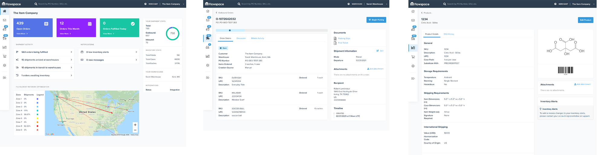
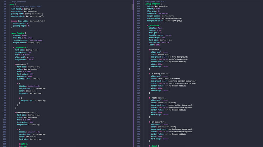
Instead of tasking the dev teams to stop feature work, I was able to build out the Strug design system into usable components in Sass and React/Typescript. All the design elements once trapped in pixel land, now became functional usable code.
Design systems are nothing new. They are helpful to reference patterns and design components, explaining in detail how design elements are used in an application, and for having a repository showing the growth and maturity of an application and its design.
In the case of Strug, onboarding devs and new designers became a breeze. We realized how much sooner we should have implemented the design system. Feature and story work were completed faster and more consistently.
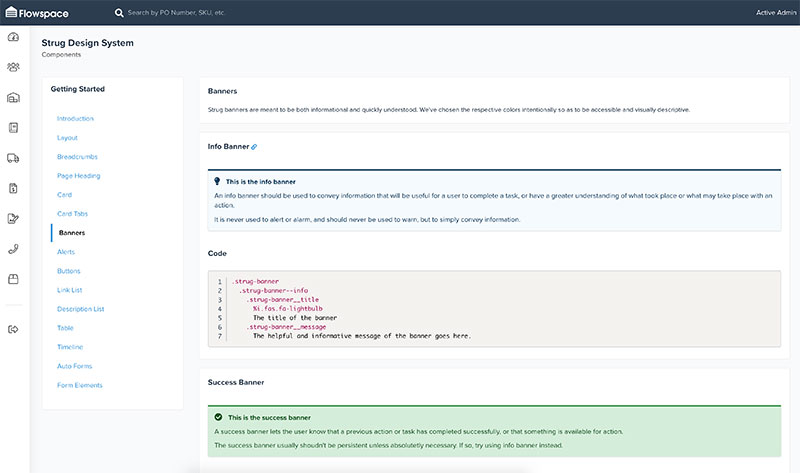
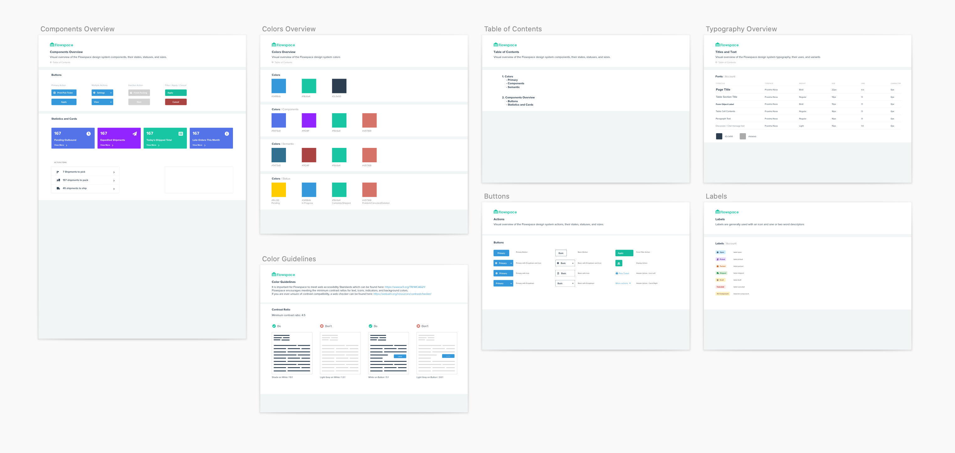
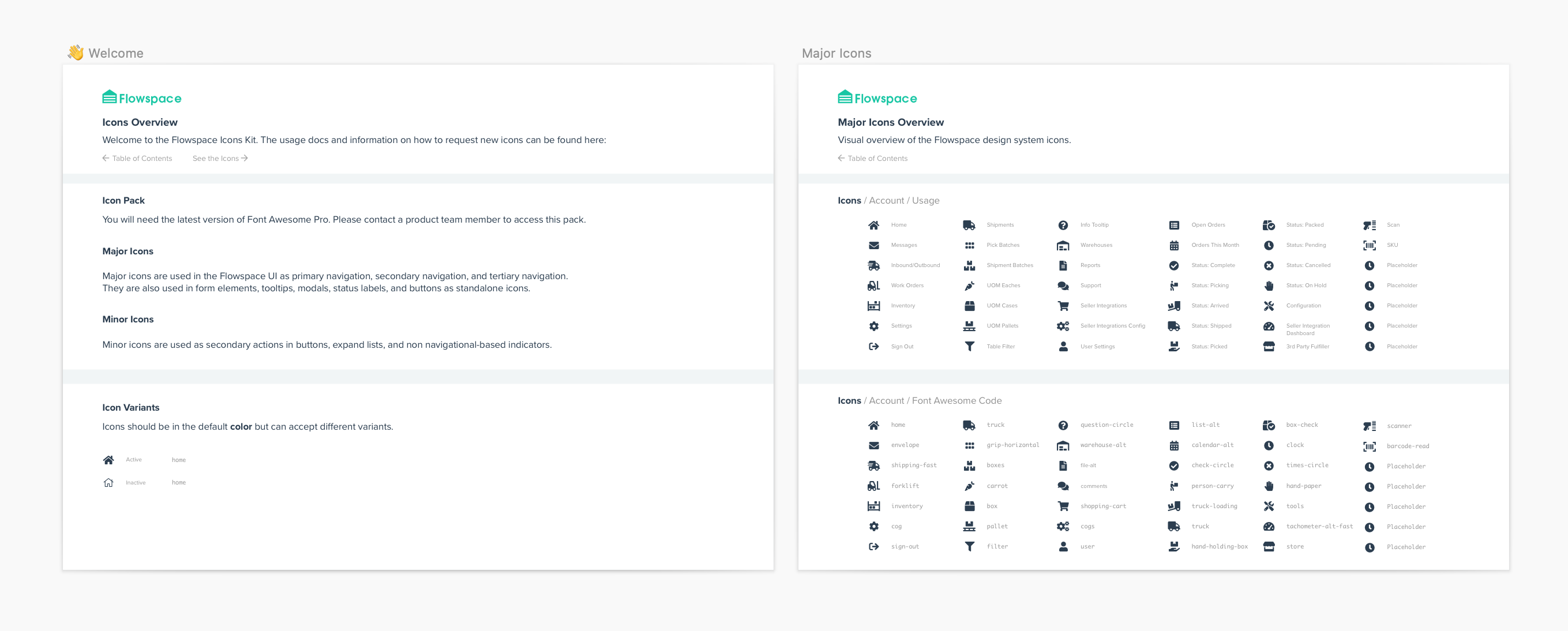
What good is a design library if the designers and devs don't know how to access it? Using our already existing code stack, I coded up an internal design library that showcased our application's design elements, the example code in which it is used, and constraints for each component.
Since I already coded up the classes and components, I organized each component hierarchically to refrence each usable and repeatable element in our app.
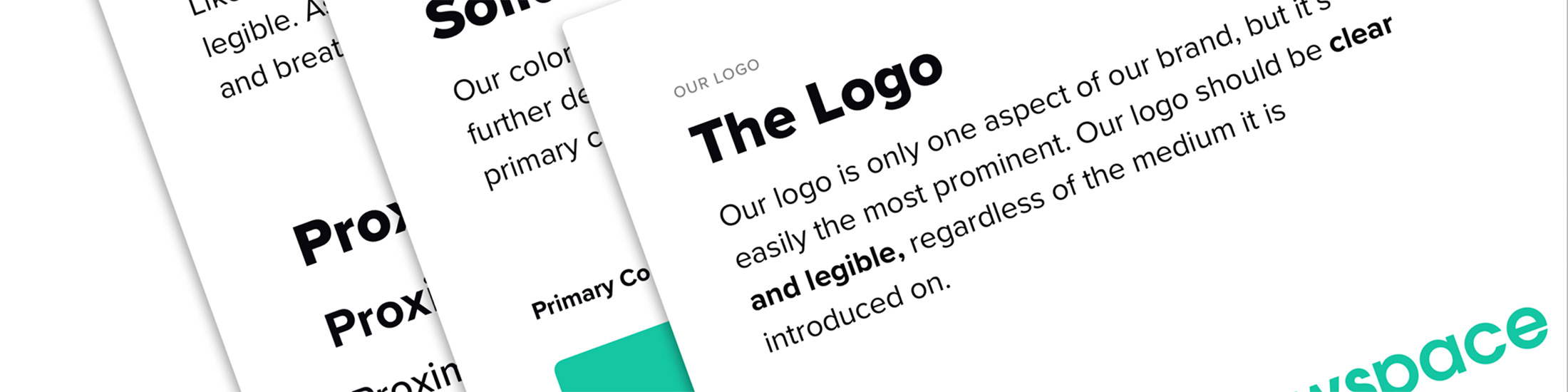
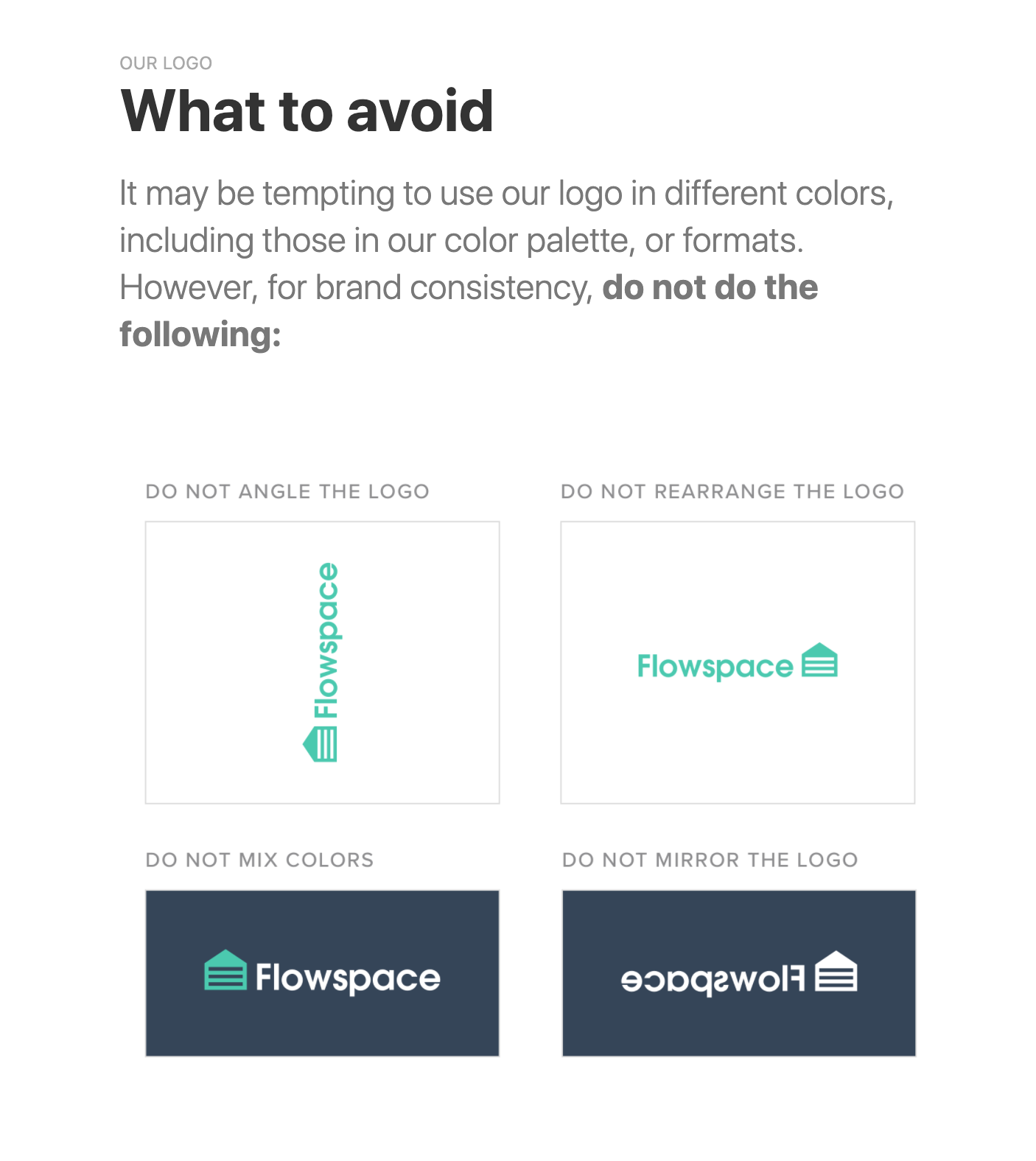
After implementing Strug, we realized, "why not take this a step further?" Not only did we use a code-based design system, but we even expanded the design library to include branding requirements for our marketing teams.
We now had a place for consultants and contractors to reference our colors, logo use, and more in one, self contained application.
Strug helps onboard designers and developers. It aids in making complex design decisions.